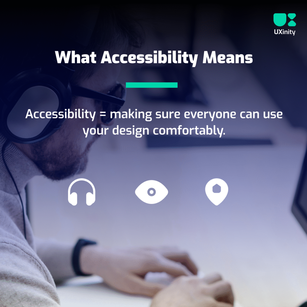
What Accessibility Really Means
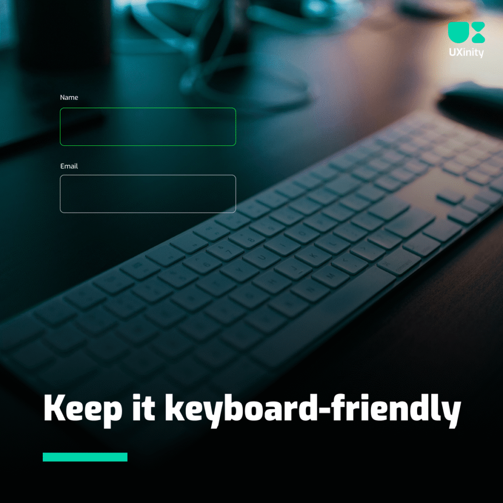
Accessibility isn’t just about adding alt text to images or adjusting contrast.
It’s about ensuring every person — regardless of ability — can use your design comfortably.
From someone with color blindness trying to read button text, to someone using a screen reader navigating your site — accessibility is about inclusion.
A truly accessible design doesn’t just meet technical standards; it shows empathy. It says, “We care about your experience too.”