
Why Most Dashboards Feel Overwhelming — And How UX Can Fix It.
- May 11, 2026
- Uxinity
- 11:47 am
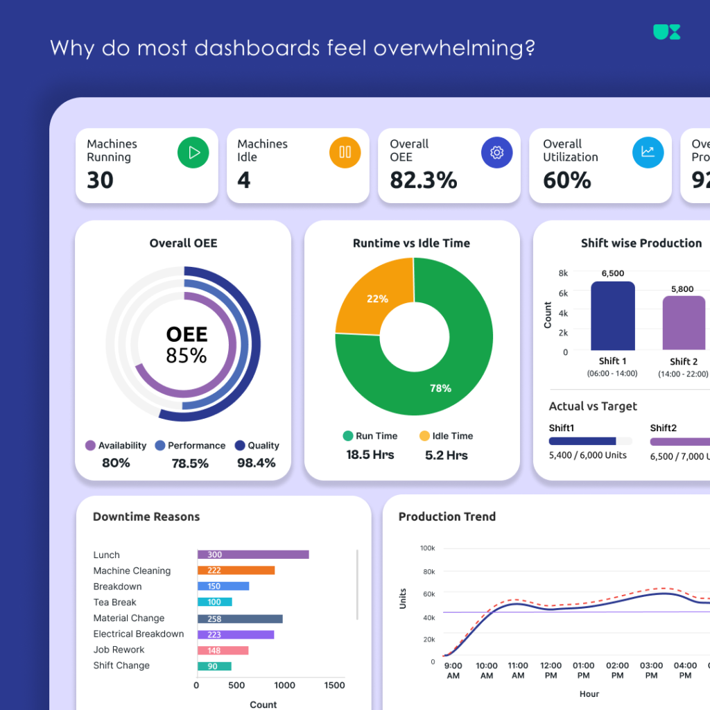
Dashboards are designed to help users understand information, monitor performance, and make better decisions.
But many dashboards do the opposite.
Instead of providing clarity, they overwhelm users with too many numbers, charts, tables, colours, and notifications. When everything is displayed at once, users struggle to understand what actually matters.
A good dashboard is not about showing more data.
It is about showing the right data, at the right time, in the right way.
In this article, let’s look at some common reasons why dashboards feel overwhelming—and how better UX design can solve them.
1. Too Much Information
One of the most common problems in dashboard design is trying to display everything on a single screen.
A business may have hundreds of metrics, reports, machine data points, or customer insights. However, that doesn’t mean every piece of information needs to be visible immediately.
When users see too much information at once, they can experience:
- Cognitive overload
- Difficulty finding important information
- Slower decision-making
- Reduced focus
How UX can fix it
Start by identifying the most important information for the user.
Use a clear hierarchy:
Primary information → Secondary information → Detailed information
Progressive disclosure can also help. Show users a high-level summary first, then allow them to explore more details when needed.
A dashboard should answer the question:
What does the user need to know right now?
2. No Clear Visual Hierarchy
When every card, chart, and metric looks equally important, users don’t know where to look first.
This is a common reason dashboards feel cluttered—even when they don’t contain a huge amount of information.
How UX can fix itCreate a clear visual hierarchy using:
- Size
- Spacing
- Typography
- Contrast
- Grouping
- Placement
For example, a critical KPI should receive more visual attention than secondary information.
Users should be able to scan a dashboard and quickly understand:
- What is happening?
- What requires attention?
- What should I do next?
3. Unclear KPIs
Numbers alone don’t always provide useful information.
For example, showing:
1,245
doesn’t mean much unless the user understands what that number represents and whether it is good or bad.
A KPI should provide context.
How UX can fix itMake KPIs meaningful by including:
- Clear labels
- Units of measurement
- Comparison with previous periods
- Targets or goals
- Trends
- Status indicators
Instead of simply showing:
Production: 1,245
You could show:
Production: 1,245 Units ↑ 12% compared to yesterday Target: 1,500 Units
Now the user can understand the information and make a decision.4. Poor Data Visualization
Using the wrong chart can make even useful data difficult to understand.
Sometimes dashboards contain too many charts simply because the data is available.
But more charts don’t always mean more insights.
How UX can fix itChoose visualizations based on what users need to understand.
For example:
- Line charts → Trends over time
- Bar charts → Comparing categories
- Donut charts → Simple proportions
- Tables → Detailed information
- Progress indicators → Goals and completion
The goal is not to make the dashboard look visually impressive.
The goal is to make the information easier to understand.
Before adding a chart, ask:
What question should this visualization help the user answer?5. Important Actions Are Hard to Find
A dashboard should not only help users monitor information—it should also help them take action.
For example, if a machine requires maintenance or a critical metric drops below a target, the user should be able to quickly understand what happened and what they can do next.
However, many dashboards display alerts without providing a clear action.
How UX can fix itMake important actions visible and easy to access.
For example:
Machine Overheating 🔴 Critical
[View Machine] [Create Maintenance Ticket]
Clear actions reduce the time between identifying a problem and responding to it.
A useful dashboard should support this flow:
Understand → Decide → Act6. Every User Does Not Need the Same Dashboard
A plant manager, machine operator, maintenance engineer, and business owner may all use the same system.
But they don’t need the same information.
Showing every user the same dashboard can create unnecessary complexity.
How UX can fix itDesign dashboards based on:
- User roles
- Responsibilities
- Goals
- Daily tasks
- Decisions they need to make
For example:
Management may need:
- Overall performance
- Production trends
- Business KPIs
Maintenance teams may need:
- Machine alerts
- Maintenance schedules
- Machine health
Operators may need:
- Current machine status
- Production information
- Immediate tasks
The Goal: Less Noise, More Clarity
A well-designed dashboard doesn’t try to display everything.
Instead, it helps users quickly answer important questions:
- What is happening?
- Is everything performing as expected?
- What needs my attention?
- Why is this happening?
- What should I do next?
When a dashboard answers these questions clearly, users can make faster and more confident decisions.
Final ThoughtsGood dashboard design is not just about beautiful cards, colourful charts, or modern UI.
It is about turning complex data into meaningful information.
The best dashboards create a clear path from:
Data → Insight → Decision → Action
So the next time you’re designing a dashboard, don’t start by asking:
“What data should we display?”
Start by asking:
“What does the user need to understand and do?”
That shift can make the difference between a dashboard that simply displays data and one that genuinely helps people make better decisions.Need Help Designing a Better Dashboard?
At UXinity, we design user-focused dashboards and digital products that help businesses turn complex information into clear, actionable insights.
Whether you’re building a SaaS platform, enterprise application, analytics dashboard, or Industrial IoT solution, good UX can help users understand more and do more with less effort.